Review Global Optics
This optic is available only if ArcSight ESM is integrated with ArcSight Platform and the Multi-tenancy feature is enabled.
Select > > .
The Global View optic is the default page that is displayed after you log in to ArcSight. By default, the map displays the geographic distribution of alerts over the last 30 days. Provider Admin users can view alert data for all tenants, while tenant users can view alert data only for their tenants.
The map provides a quick overview of alerts in your environment worldwide. Red dots on the map indicate the locations where alerts originate, with the dot size reflecting the alert volume. The higher the number of alerts at a location, the bigger the dot.
The color of the dot represents the alert priority. The priority refers to the level of urgency assigned to an alert.
Filtering Alerts
The slider allows you to filter the alert data displayed on the map by priority.

Alert priority has the following levels:
-
Very High
-
High
-
Medium
-
Low
-
Very Low
As you move the slider back and forth, the map refreshes to show locations that have alerts for the selected priority index.
The higher the alert priority, the bigger the risk. High-priority alerts need immediate attention from security practitioners to mitigate security risks.
Viewing Alerts for a Specific Location
To view alerts for a specific location, mouse over the dot on the map. You can view the following details for alerts:
-
Name of the location.
-
Total number of alerts at the location. Depending on the priority levels existing for the selected time, the donut chart is divided into segments, each of which is colored differently. Each segment represents an alert priority.
-
Alert count and percentage of alert count by priority.

Viewing Top 5 Alert Categories
A series of cards below the map display the top 5 categories that generate the highest number of alerts in your environment.
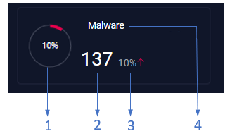
Each card provides the following information as shown in the preceding image:
-
1 - Percentage of alerts contributed by the alert category to the overall alert count.
-
2 - Total number of alerts in the category.
-
3 - Percentage change in the alert count when compared to the previous time frame. A green downward arrow (
 ) indicates a decrease in the alert count, while a red upward arrow (
 ) indicates an increase in the alert count.
 -
4 - Name of the alert category.
When you mouse over a card, you can view more information about the alerts in the category as shown in the following image:
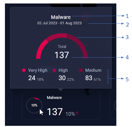
Where,
-
1 - Name of the alert category.
-
2 - Duration for which the alert count is displayed.
-
3 - Distribution of alerts in the category by priority. Depending on the priority levels existing for the selected time, the semi-circle donut chart is divided into segments, each of which is colored differently. Each segment represents a priority.
-
4 - Total number of alerts in the category.
-
5 - Alert count and percentage of alert count by priority.