Tab
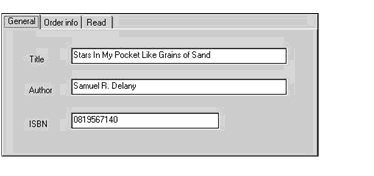
Available only in graphical environments, the tab control combines a box with a tab for a control that looks like a file folder. The user clicks any tab to bring it forward. The program typically places different screen elements in the box, depending on the tab selected.
Tabs can be oriented horizontally at the top or bottom of the control, or they can be oriented vertically at the left or right of the control, via the control's Tab Orientation property. Note that if the tab page is filled to its outer edges, you may have to make slight resizing or repositioning adjustments when you change the tab orientation.
When a user clicks a tab, the program is informed of the new selection and the tab's appearance is updated. The behavioral distinction between tabs and push buttons is that a tab responds immediately when clicked, and a push button responds with the clicked event only when the mouse button is released. You may allow the user to activate the tabs with the keyboard by accepting the tab control as any other control, but you need not do so if you wish to provide only a mouse interface.
When you create a tab control in the Screen Designer, there are a few special features to keep in mind. First, note that you can select either the entire tab control (the highlight frame and handles outline the control) or a page of the control (the highlight frame and handles define a rectangular region that does not include the tab portion of the control).
Note also that when you have selected a tab control or one of its pages, the Property window indicates the nature of the current selection. If the entire control is selected, the Property window entry begins with Tab Control (followed by the control name). If a tab control page is selected, the Property window entry begins with Page (followed by the page name).
The tab control uses the following special editing commands:
- To add a new page to the tab control, make sure that the entire control is selected, then right-click and select Insert New Page (near the bottom of the right-click menu).
- Once your control contains multiple pages, you can select Next Page or Previous Page from the right-click pop-up menu to navigate the control. If the entire control is selected, you can also switch between pages of the control by clicking the tab portion of the control.