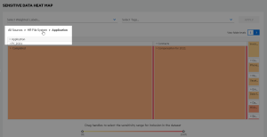
Sensitive data heat map
The Sensitive Data Heat Map dashboard depicts the quantity of data processed from file system and SharePoint sources relative to identified sensitive content. You can quickly see where your sensitive data is clustered and drill down to explore further.
Each block in the heat map represents a data set (repository, directory, or documents within a directory). The size of the block reflects the number of items in the data set relative to the other data sets at the same level. The color of the block reflects the percentage of sensitive data within the data set.
Hover over a block to view the data set path, the number of items included, and the percentage of sensitive items, as well as take additional actions.
In the pop-up detail window, click CREATE/EDIT REPOSITORY to create a new repository based on the data set or edit the repository if the data set represents an existing repository. The repository path is defined by the data set block selected
If creating a new repository, define the repository name, description, and default file action. You cannot edit the connection information. OCR settings, schedule, attributes, grammars, and entities are carried over from the original repository but cannot be edited here—make any additional updates in Connect.
If editing an existing repository, you can edit the name of the repository. Depending on the existing action to be taken on files, you may be able to increase the level of processing (such as "Full Scan (Metadata)" to "Full Scan (Analyzed)" or increase the sampling rate for a Smart Scan). You cannot edit the connection information. OCR settings, schedule, attributes, grammars, and entities are carried over from the original repository but cannot be edited here—make any additional updates in Connect.
In the pop-up detail window, click VIEW ITEMS to view the document list for the items within the data set.
Click a block to refocus the heat map on that data set. Click a portion of the breadcrumb path above the heat map to return to the top level or refocus the view to the desired level.
Click and drag one or both end handles of the sensitivity percentage slider beneath the chart to show a refined range of sensitivity.
Select one or more weighted labels and tags to focus the heat map based on a desired sensitivity. Click in a filter, select the desired labels or tags and then click APPLY; click the associated X for a selected weighted label or tag to remove it from the filter.
Click the number buttons above the heat map to view either two or three levels of data sets. Defaults to three levels.


