

| Creating a Data Definition and Screenset | Control Objects | |
The previous chapters described the basic concepts used in Dialog System and the first step that you need to take to design a graphical user interface. This chapter describes the window objects that are appropriate for your application.
Objects are the building blocks of Dialog System. There are two types of objects, control objects, described in the chapter Control Objects and window objects, described in this chapter which covers:
A window is an object which is a basic visual element of your user interface. Windows are extremely flexible. They can be sized by the user and have menus in the form of menu bars with pull-down menus. You can put any objects in a window, including other windows.
The user interface you build can take many forms, ranging from simple menu selection and data entry fields to fully developed windows complete with menu bars, radio buttons and other controls.
The level of sophistication of the interface you choose depends on many factors including:
In all cases:
Figure 4-1 shows the visual components of a typical window.
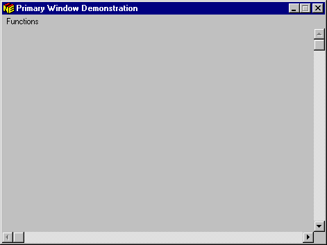
Figure 4-1: Typical GUI Window
The properties you choose for your window depend on what you want to display and how you want the user to react to your application. Available properties include:
The desktop is the working area on your screen. You can create windows on the desktop. You can have a very large number of windows in your interface (see the topic Dialog System Limits in the Help), but only one is displayed when the interface initially runs. This window is called the First Window.
The desktop can contain the following kinds of windows:
The first window you create is called the primary window. It is a child of the desktop (or you could say that the desktop is its parent), because there are no other windows above it. It exists independently of any other window, so any action taken on any other window has no effect on the primary window. You may create more than one primary window.
Any primary window can have child windows, called secondary windows. These in turn can have other secondary windows. A secondary (or child) window is used to support the parent window. Many of the actions of a secondary window are determined by the boundaries of the primary window. If you display a secondary window, its associated primary window is also displayed. This relationship between windows has a significant effect on how the user interacts with your application.
For example, a personnel application could have a primary new employee window and multiple secondary windows to enter information such as address, next of kin and other personal details.
If you choose to have a secondary window as the First Window, then both the secondary window and its parent are displayed when the screenset initially runs.
Some of the characteristics of the relationship between primary and secondary windows are:
Note: The parent of a primary window is the desktop. You can change a primary window to be the child of another window at run time using the function SET-DESKTOP-WINDOW. Refer to the section Changing the Default Parent Window in the chapter Using Dialog, and the topic Dialog Statements: Functions in the Help for a description of this function.
Secondary windows and dialog boxes have similar functions, that is, the display and collection of information. The section Dialog Boxes Versus Windows provides some tips on when to use a dialog box and when to use a secondary window.
In Dialog System, you can choose whether or not the secondary window is clipped within the primary window. A window is clipped if the window information is truncated at the border of the parent window.
Figure 4-2 shows an example of a clipped and a non-clipped secondary window.
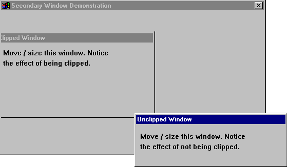
Figure 4-2: Clipped and Non-clipped Windows
You might wish to have a secondary window that is clipped if you need to maintain a particular visual layout of your screen. For example, the window displayed might be similar to a paper form the user is already familiar with, so you can use clipped secondary windows to maintain that visual similarity.
However, a non-clipped window gives users more flexibility. Users can move the secondary windows anywhere on the desktop, and arrange the screen layout however they wish.
The sample application Objects shows the effect of both clipping and not clipping a secondary window.
You must define a primary window before you can define any other window object. Then you can define either a clipped or a non-clipped secondary window.
Whichever type of window you define, a box appears in the top left-hand corner of the main window. To position and size the window, move the mouse pointer to the position you want the top left-hand corner of the window to be and click to fix this. Move the mouse to the position you want the bottom right-hand corner of the window to be and click once more to fix it. You can then see the new window.
If you specify a dialog box as the child of a clipped child window, its parent will not actually be that clipped child window but the parent of the clipped child window. On creation, the new dialog box is positioned relative to the clipped child window, but thereafter it is positioned relative to the clipped child window's parent. As a result, there is a restriction when painting a screenset in which a clipped window has an unclipped child window. The child window cannot be moved correctly to a new position in the usual way: first you need to change its properties to a clipped window. After the move, the clipped property can be removed.
There are no constraints on the size of a window and it can be larger than the Dialog System main window or positioned outside the main window (if you have Desktop mode set on). When you run the screenset, Dialog System positions and sizes all windows exactly as you created them.
The visual components of a window are described in the section Components of a Window earlier in this chapter. The Window Properties dialog box, shown in Figure 4-3, enables you to select the properties for your window.
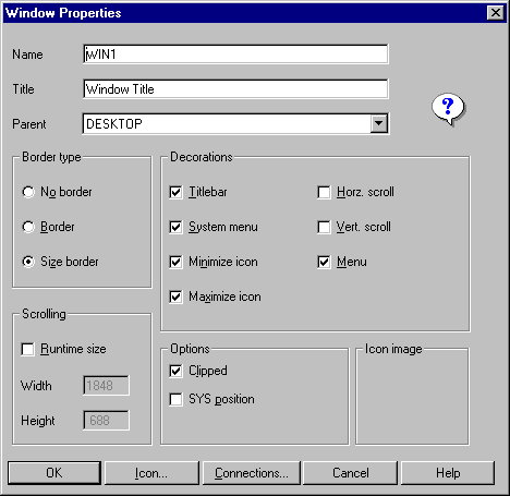
Figure 4-3: Window Properties Dialog Box
See the Help for information on each of these properties
Once you have defined the visual characteristics of a window, you can use dialog to manipulate the window. See the section Windows Dialog in the chapter Using Dialog for further information.
Most often, dialog boxes are used to display or obtain information. This information is displayed or obtained through a collection of controls, such as text fields, data entry fields and buttons, that are displayed on the dialog box. (A maximum of 255 objects can be put on a dialog box.) They have the following properties:
Typically, a user clicks a button to cause Dialog System to accept user actions (for example, clicking OK to accept a selection from a list). Alternatively, a user may click a button to cause Dialog System to ignore user actions (for example, clicking Cancel to close a dialog box, ignoring any input).
Figure 4-4 shows some typical dialog boxes.
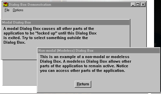
Figure 4-4: Typical Dialog Boxes
A dialog box can be application modal, parent modal, or modeless. The one you choose depends on how you want the user to react to the dialog box.
A parent modal dialog box means that the window in which the dialog box was created is frozen until the user exits from the dialog box. That is, you cannot access the window until the modal dialog box is exited. However, you can access other primary windows and objects outside the application.
An application modal dialog box means that all other parts of the window hierarchy, and all objects within the application are frozen until the user exits from the dialog box.
You might use an application modal dialog box to ask the user to enter a filename. The application cannot proceed until the user enters a filename (or cancels the action).
Dialog System itself makes use of modal dialog boxes. For example, the About dialog box is modal. (Select About on the Help menu to see this dialog box.)
A modeless dialog box means that other parts of the application are still active when the dialog box appears. The information that is displayed or requested is not immediately necessary for the continuation of the application.
A modeless dialog box is preferred because it gives the user the maximum flexibility in interacting with the application. However, cases exist, such as the one described above, when an application modal dialog box is necessary.
The sample application Objects illustrates application modal versus modeless dialog boxes. Run the screenset to see the effects of each option.
As you can see, windows and dialog boxes are very similar. In fact a dialog box is a special type of window. See the section Dialog Boxes in the chapter The Graphical User Interface.
Often, you have a choice between using a dialog box or a window in your application. To help you decide when to use a dialog box and when to use a window, we offer the following guidelines:
Use a dialog box instead of a window when:
Use a window instead of a dialog box when:
A message box is used to give the user a message. It contains only text and/or graphics to present the information, and buttons to let the user choose an action and remove the message box. Usually, these messages are displayed by the application as a result of some event, for example, a "file not found" event.
You cannot define the size or position of a message box.
Figure 4-5 shows a typical message box.
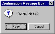
Figure 4-5: Typical Message Box
Dialog System provides the following general types of message boxes depending on the nature of the message. You can identify each type by a different icon.
| Notification | Notifies the user of a condition to which the user may or may not want to respond. For example, telling the user the printer is out of paper may not affect what the user is currently doing. |
| Information | Passes information to the user. It requires no response from the user other than confirmation that the message was read. For example, a product information message is an informative message. |
| Warning | Indicates that a condition exists that may cause undesirable effects. For example, you can issue a warning message when the user is approaching a limit on the number of files opened. |
| Question | Indicates that a condition exists that requires a user response. For example, the user has selected a Delete file option and the message asks the user to confirm the deletion. |
| Critical | Indicates that a condition exists that will cause
undesirable effects if the user continues. For example, the user has
opened the maximum number of files and to continue will cause the system
to halt. |
You must have at least one push button in the message box, so the user can respond to the message. Dialog System provides six pre-defined combinations of push buttons that you can use:
For example you could use:
You can determine which button the user selected using dialog. The codes that identify the button that was clicked are listed in the description of the INVOKE-MESSAGE-BOX function. See the topic Dialog Statements: Functions in the Help.
As an example, suppose the user selects Delete file on a menu. The message box (Figure 4-5 above) is invoked so the user can confirm that the file is to be deleted.
There are three types of menu:
The menu bar is a list of commands at the top of the window – or more accurately, it is a list of groups of commands, because selecting one command usually presents the user with further choices.
See the topic Objects and Properties in the Help for information on defining a menu bar.
Menu choices can:
See the section Pulldown Menus below.
Any one menu choice can only have one of the actions described in the preceding list, and is decorated (for example with an ellipsis or a checkmark) appropriately.
When you select a choice on the menu bar, a pulldown menu drops down from the choice. These are the actions you can perform on the object. Figure 4-6 illustrates a typical pulldown menu.
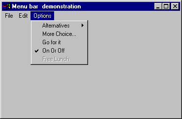
Figure 4-6: Typical Pulldown Menu
There are several possible actions that can happen after you select a choice. Usually, the menu choice includes a visual cue to indicate the type of action. The following list describes visual cues and their associated actions.
| Arrow | Invokes another pulldown menu at the side of the current one to give you further menu alternatives from which you can choose. |
| Checkmark | Shows whether or not a choice is in effect. When the checkmark is toggled on, the choice is operational. When it is off, the choice is not operational. When a checkmark choice is off, you cannot distinguish it from an ordinary menu choice that performs immediately. |
| Dimmed | Shows that the choice is not available. |
| Ellipsis (...) | Invokes a dialog box or secondary window presenting a more complex choice, for example choosing from a list of files or selecting a radio button. |
| No distinguishing marks | Performs the action immediately. |
Examples of menu bar dialog are discussed in the sections Menu Bar Dialog and Enabling and Disabling Choices in the chapter Using Dialog.
The topic Objects and Properties in the Help tells you how to define menu bars.
Context menus provide a quick and easy method for performing operations relevant to your work area in Dialog System. If you right-click on the screen, Dialog System displays a menu of choices appropriate for the item you have clicked on. For example, the context menu is different for a push button object in the main definition window from a dialog line in the dialog definition window.
An example of a context menu is given below:
Select Global dialog on the Screenset menu.
Right-click on any of the lines of dialog.
Dialog System displays a context-sensitive menu, as shown in Figure 4-7.
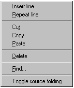
Figure 4-7: Global Dialog Context Menu
An icon is a small graphic that represents a window when it is minimized. When you create a window or dialog box, you can attach an appropriate icon to use when it is minimized.
To attach an icon to a window:
The Window Properties dialog box is displayed.
This displays the Icon Selection dialog box, shown in Figure 4-8, which contains the list of icon names available in the bitmap file. The file ds.icn is always the default.
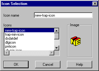
Figure 4-8: Icon Selection Dialog Box
Ensure that Minimize Icon is selected or the icon will not be used.
Copyright © 1998 Micro Focus Limited. All rights reserved.
This document and the proprietary marks and names
used herein are protected by international law.
| Creating a Data Definition and Screenset | Control Objects | |