

| Window Objects | Using Dialog | |
The previous chapter looked at window objects. This chapter describes:
Control objects are also known as widgets or gadgets and they can be used in windows and dialog boxes. They cannot exist outside a window or dialog box, so you have to define a window or dialog box and select it before you can define controls. See the chapter Window Objects for further details.
Depending upon the control, you can use it to:
The controls covered in this chapter are:
| Control
|
Use to
|
|---|---|
| Text and Entry fields | Read and enter data items, and supply text for labeling. |
| Push buttons | Enable the user to select an immediate action. |
| Radio buttons | Give the user a fixed set of mutually exclusive choices, when grouped. |
| Check boxes | Give the user a set of choices that are not mutually exclusive, that is, the user can select none, any, or all of the choices. |
| List boxes | Display a list of choices from which the user can select one or more. |
| Selection boxes | Present a scrollable list of choices and place a selection in an entry field. |
| Scroll bars | Enable the user to scroll to a particular value, when used with another control like an entry field. |
| Group boxes | Outline a control or group of controls for the visual convenience of the user. |
| Tab control and Tab control pages | Organize information like a spiral bound notebook containing pages and tabbed divider pages. |
| OLE2 controls | Display a window from which the user can call any external object, for example, a spreadsheet. |
| User controls | Contain objects not paintable by the Dialog System definition software. How you use a user control depends on its implementation. |
| ActiveX controls | Display objects with predefined functions, usually supplied by third parties. |
The most basic controls are entry fields. This section describes:
A text object is a control that you can use to help your user understand what information is displayed or asked for. You can think of a text field as a label. Figure 5-1 shows an example of the use of text fields.
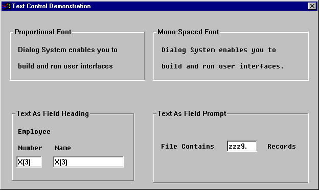
Figure 5-1: Examples of Text Fields
You can use text fields as:
A text field is static. That is, no events or functions are associated with a text control. If you need a text field that you can change at run time, such as a status line or a dynamic prompt, use a display-only entry field. See the section Display-only Entry Fields for more information.
The topic Objects and Properties in the Help provides detailed information on defining text fields.
Entry fields are control objects that display the contents of a data item at run time and enable the user to edit the contents. You use an entry field when you do not know the possible values for a data item. In this situation, the user must supply the needed information.
An entry field is associated with a data item. Changes to the entry field made by the user are immediately put into its data item with no further action on your part. If the contents of the data item change, the entry field must be refreshed before it reflects the change. An entry field is refreshed when:
An entry field is not refreshed when its parent window is shown using the SHOW-WINDOW function.
If you set focus on a numeric entry field and the associated master field does not contain valid numeric data, the value will be set to zero.
Dialog System provides two types of entry fields – single line entry and multiple line entry (MLE).
The simplest entry field is a single line entry field, which can display or collect only one line of text.
As an example, in the Customer sample, users must supply information such as customer code, name, address and credit limit. They enter this information using entry fields.
Figure 5-2 shows several examples of single line entry fields.
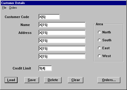
Figure 5-2: Examples of Entry Fields
You can also use entry fields with other controls to help the user select appropriate values.
For example, if you know the data item is in a particular range of values, you could use the entry field with a scroll bar to let the user "scroll" to the correct value.
Figure 5-3 shows an example of using an entry field with a scroll bar.
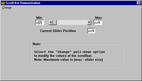
Figure 5-3: Using an Entry Field with Scroll Bar
You can find an example of the dialog needed to implement this feature in the chapter Sample Programs.
The topic Data Definition and Validation in the Help describes how to set up validation checks using Data Definition.
Some entry fields need to be display-only. For example, you might have a dialog box that lets the user update address information for employees. You might want the user to see, but not update, some fields, for example the employee name.
Another use of display-only entry fields is to build dynamic prompts or status lines. For example, you might not know the exact wording of a prompt at definition time. You can make the prompt a display-only entry field, then supply the correct text at run time.
To illustrate how to make a dynamic prompt, you might have a
display-only entry field that is associated with an item in the Data Block
named generic-prompt. In your program, fill the item using a
statement like:
move "Dynamic Prompt" to generic-prompt
The new prompt is then displayed when the entry field associated with
generic-prompt is refreshed.
Display-only is a property of single line entry fields. The topic Objects and Properties in the Help describes how you set an entry field to display-only.
Autoswipe is a property of an entry field: when the user tabs to the field, all the data associated with that field is selected. If the user inputs any data in the field, the field is cleared before the new data is entered.
You can use Autoswipe to clear a default value when you know the user would not use the default. For example, if you use an entry field to enter a filename, you may want the default to be a descriptive string like filename.ext. This gives the user an indication of the format you expect for the filename, but it is unlikely that a file would have that default name.
As soon as the user enters any data in the field, the existing text is cleared and the data entry begins in the first position of the field.
The SET-AUTOSWIPE-STATE function lets you change the Autoswipe state of an entry field. In the example above, once the user has entered a valid filename, you may want to set SET-AUTOSWIPE-STATE off. Then when the user tabs to this field, the field is not cleared before data is entered. See the topic Dialog Statements: Function in the Help.
Like a single line entry field, a multiple line entry field (MLE) enables you to display and edit the contents of a data item. However, this control is most useful when you have a lot of information to collect, for example a lengthy text description of a product.
The MLE appears on the screen as a box with horizontal and vertical scroll bars. The scroll bars allow you to adjust the view of the data in the MLE. The scroll bars do not have any dialog associated with them; that is, Dialog System controls all the scroll bar actions for the MLE.
Figure 5-4 shows two MLEs. The one on the left has the word-wrap option set and the one on the right does not.
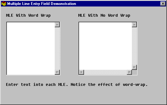
Figure 5-4: Multiple Line Entry Field
The data item associated with the MLE can contain alphanumeric and DBCS characters, and line feeds (ANSI decimal 10, x"0A"), which place successive characters on the next line in the display area of the MLE as you would expect. The user can view characters that extend beyond the right-hand or lower boundary by using the scroll bars.
You can set the MLE to word-wrap the displayed text so it never extends beyond the right-hand boundary. Single words that cannot fit are simply split.
The Objects sample program shows the differences between an MLE that has the word-wrap option set and an MLE that does not.
You can put or edit text in the MLE by:
When an MLE's data item is changed at run time, the MLE needs to be refreshed before the change is visible. An MLE is refreshed when:
Changes made by the user to the MLE are immediately put into its data item with no further action on your part.
A push button lets a user select an action. The action indicated by the text in the push button occurs immediately. Figure 5-5 shows an example of a window with a push button.
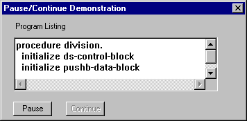
Figure 5-5: Typical Push Button
When you define a push button, you can use the Push Button Properties window to attach a set of bitmaps, instead of text, to a push button. You define a bitmap for each of the three possible states a push button can be in; normal, disabled, and depressed.
You must define a bitmap for the normal state. If you do not define a bitmap for the depressed or disabled states, the bitmap defined for the normal state is used.
However, you might want to set or change bitmaps at run time. See the chapter Using Bitmaps to Change the Mouse Pointer for further information.
Unlike push buttons, you can group radio buttons together to show the user a fixed set of mutually exclusive choices. For example, Figure 5-6 shows this use of radio buttons, in which the user must select only one method of billing.
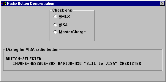
Figure 5-6: Typical Radio Buttons
Grouping radio buttons gives them the characteristic behavior, which is that only one button in the group can be selected at a time. When the user selects a new button, the previously selected button is deselected. See the section Grouping Controls in this chapter for a description of how to define a control group.
The dialog associated with a radio button is the same as the dialog for a push button. For example, the radio button VISA can have dialog such as:
BUTTON-SELECTED
    BRANCH-TO-PROCEDURE BILL-TO-VISA
where the procedure BILL-TO-VISA contains the necessary
billing functions.
Note: You can deselect a radio button only by selecting another radio button within the control group.
For information on defining a radio button, see the topic Objects and Properties in the Help.
Check boxes are much like radio buttons except the user can select choices that are not mutually exclusive. For example, as shown in Figure 5-7 you can use check boxes when you have a "check all that apply" situation.
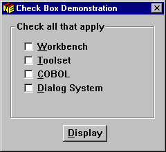
Figure 5-7: Group of Check Boxes
You can attach a numeric data item to a check box. If the check box is set, the data item associated with the check box is set to one. If the check box is not set, the data item is set to zero.
See the chapter Sample Programs for further information.
You use list boxes to display a list of choices from which the user can select one or more. A list box consists of:
Dialog System provides three types of list boxes:
The Objects sample application shows the differences between a single selection list box and a multiple selection list box.
Figure 5-8 shows an example of a list box.
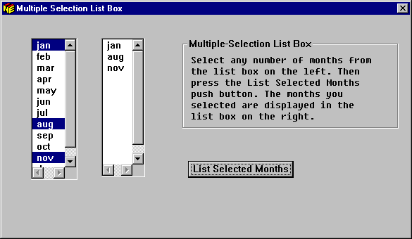
Figure 5-8: Example of a List Box
For information on defining a list box, see the topic Objects and Properties in the Help.
You can insert items into the list box in the following ways:
You can associate the list box with a group item, such that each line in the list box displays an occurrence of the group. Selected items in the group then occupy fields in each line.
This is probably the most common way of using a list box. For an example program, see the chapter Sample Programs.
You can type in items at definition time as part of the list box properties . These items are inserted in the list when the box is created at run time. Subsequently, they are just like any other inserted list items. For example they can be changed, deleted or have other items inserted between them.
This is an effective way of adding items to the list if you have a small number of entries that you always want to have in the list. See the topic Objects and Properties in the Help for further information on how to add choices to a list box in this way.
This is an effective way of populating a list box if you have a few choices in your list and you want to keep the Data Block as small as possible. Although it does not require much time to fill a small list box, it does take a little time and adds to the number of dialog statements that have to be executed.
This method offers two advantages:
It does, however, add to the size of the Data Block passed between your program and Dialog System, but it is faster than adding the data items to the list one at a time.
For an example, see the chapter Sample Programs.
A selection box is a control object that is used to present a scrollable list of choices and place a selection in an entry field. It is sometimes known as a combination box or combo box.
Figure 5-9 shows the three types of selection boxes that are available:
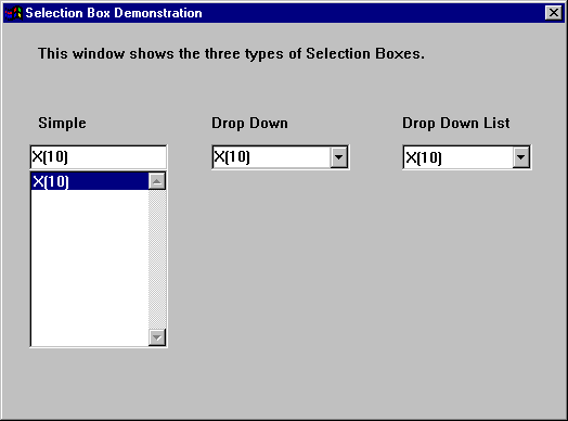
Figure 5-9: Typical Selection Boxes
The following describes the types of selection boxes:
You define the three types of selection box in exactly the same way, then choose the specific type you want as a property in the Selection Box Properties dialog box.
To add selection boxes individually to windows or dialog boxes:
If you define a selection box where the drop-down list will obscure other controls in the window or dialog box, ensure that the selection box receives focus before the controls that might be obscured. Either define the selection box first, or use Controls on the Edit menu to change the control order. This ensures that all the controls are properly displayed at run time.
The entry field part of the selection box is linked to a data item called its master field. You normally place text in the entry field just to supply a default choice.
To display the contents of the master field in the entry field at run time, the selection box must be refreshed. A selection box is refreshed when:
If you show a selection box using the SHOW-WINDOW function, it is not refreshed.
If the user makes changes to the entry field by typing or selecting a choice in the list box, these changes are immediately put into the master field with no further action on your part.
Selecting an item in a selection box causes an ITEM-SELECTED event to be generated.
You can place text items in the list box in the following ways:
These items are inserted in the list when the selection box is created. After that, they are just like any other list item. For example, they can be deleted or have other items inserted between them.
For a description of this (and other) methods of adding items to the list box see the section Adding Items Using Dialog in the chapter Sample Programs.
In a list box and an MLE, a scroll bar indicates the position and quantity of information visible in the list box. Using the scroll bar, the user can adjust the view of the information visible. However, in Dialog System you can also create a scroll bar as an independent control.
As an example, you can use the scroll bar with an entry field to let the user "scroll" to the correct value. The scroll bar example in the sample application Objects shows this usage.
Figure 5-10 shows a horizontal scroll bar.

Figure 5-10: Horizontal Scroll Bar
The Scroll Bar Properties dialog box lets you assign defaults to scroll bar properties such as slider range, slider position and slider size. Using dialog, you can change these properties.
You can see a coded example in the chapters Tutorial - Creating a Sample Screenset and Tutorial - Using the Sample Screenset. For information on defining a scroll bar, see the topic Objects and Properties in the Help.
A group box is a graphic frame used to outline a control or group of controls purely for the visual convenience of the user. This encourages the use of several controls to be understood as a group. Figure 5-11 shows an example of a group box.
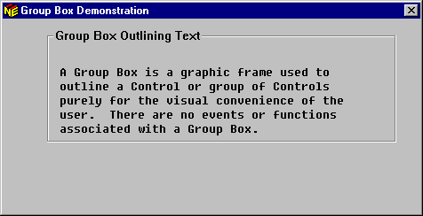
Figure 5-11: Typical Group Box
Like a text control, no events or functions are associated with a group box.
For information on defining a group box, see the topic Objects and Properties in the Help.
A tab control enables related information to be organized in a way that is intuitive and easy to use. Figure 5-12 shows an example of a tab control.
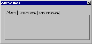
Figure 5-12: Typical Tab Control
A tab control is made up of individual pages. These are combined into a single control with each page represented as a tab along one edge (usually the top) of the control. Selecting a tab displays the associated page.
Tabs can contain text or bitmaps. If all the tabs do not fit on a single line, they can be displayed either with scroll arrows to move through the tabs, or the tabs can be wrapped over several lines so that they are all visible.
The visible area of the tab control is always the top page. Pages can contain any Dialog System control objects, apart from another tab control or window.
You can see a coded example in the chapter Sample Programs.
An OLE2 control is a window, inside which you can display external data or objects, such as spreadsheets and bitmaps.
As an example, you can use the Paintbrush application to design and edit a picture, and then load that picture into your OLE2 window.
You use a user control as a container for an object that is not paintable by the Dialog System definition software.
Events and functions on a User Control are implemented in a controlling program associated with the object. Typically the controlling program uses the class library to create and maintain the object.
You create and manipulate User Controls by generating the controlling program at definition time. The advantage of using a controlling program is that the object is completely user-definable while still having the benefits of being integrated with the Dialog System and run-time software.
Integrating user control objects with the definition software provides the following benefits:
For information on creating and manipulating user control objects, see the chapter Programming Your Own Controls.
ActiveX controls are supplied by third-party vendors and can be integrated into Dialog System applications. The benefits listed above for user controls also apply to the use of ActiveX control with your screenset. Additional benefits of using ActiveX controls are that you can:
You need to purchase a development licence for any controls you may wish to use in your application. You are also bound by the vendor's licence agreement for the production and distribution of that control.
When controls, such as entry fields, radio buttons, and push buttons appear in a window or dialog box at run time, the user can move the keyboard input focus around them by pressing Tab.
Sometimes, several controls form a logical group (for example, a set of radio buttons) and either the user is interested in all the controls in the group or none of them. Therefore, it is convenient for successive presses of Tab to move the focus onto the group and then away to the next control or group. You can use the cursor keys to move around controls in a group. (Again, this is the default action, which you can change if you choose.)
You can achieve this behavior by putting the controls into a control group.
You must put a group of radio buttons into a control group so that they have the characteristic behavior that only one radio button in the group can be selected at a time. When one is selected, all the others in the same group are unselected.
Usually, you want the focus to start on the control or control group that the user is most likely to operate, and move around them in a convenient order with successive presses of Tab. The order of controls within each group also needs to be specified so the focus lands on the first control when Tab is used, and the cursor keys move the focus around the group's controls in a convenient order.
Note: You cannot Tab into a control group when the first item of the group is disabled.
You can specify the order of controls and groups in each window or dialog box. The procedure for doing this is explained in the topic Dialog System Overview in the Help.
Dialog System provides an alignment mechanism that makes it easy to align graphical objects when moving or sizing in a graphical environment.
Most of the alignment functions are available on the Alignment toolbar, which is available on the Alignment tab page. See the topic Dialog System Overview in the Help for a description of the Alignment toolbar.
The alignment options mean that you don't have to position controls exactly when you define them. You can quickly add the controls you need in rough form and then use the Alignment toolbar buttons to set the spacing and sizing.
Most alignment operations will require a combination of the alignment functions. For example, you might want to place a set of four push buttons near the bottom of the window. The steps you might follow are:
If the spacing is not ideal, there is an alternative way to align the buttons:
This effectively gives no spacing.
-or-
This increases the spacing between the controls.
Suppose now that the four push buttons are not in the correct order. You can rearrange them by using the Shuffle button. For example, the four push buttons might be labelled OK, Insert, Cancel and Help respectively and you want to change the order to Help, Cancel, Insert, and OK.
To rearrange the buttons, first select them in the order you want them. To do this:
Repeat this step for the Insert and OK push buttons.
The order becomes Help, Cancel, Insert and OK.
Each button has been swapped with another in the group into the order in which you selected them. The default order of swapping is left to right. That is, in this example, the OK button is the first to swap, Insert the second, Cancel the third and Help the fourth.
With all the alignment functions, you can undo the last operation by selecting Undo on the Edit menu.
The following steps describe how to space the four push buttons vertically down the right-hand side of the window:
You can now move the controls to their ideal position on the window and use Reorder objects to rearrange the order if necessary.
You can see examples of the Dialog System Control objects by running the Objects sample program supplied in your installation DialogSystem\demo\objects directory.
This section explains how to use bitmap graphics with your Dialog System interface. Dialog System enables you to choose the bitmaps you want to use in your user interface for the following objects:
| Bitmap object | A decorated object the user can select. |
| Icon | A small bitmap that represents the window or dialog box when it is minimized. See the section Attaching an Icon in the chapter Window Objects. |
| Mouse pointer | A bitmap is used to indicate the mouse pointer, and indicate the different states of the mouse or the system. See the chapter Tutorial - Using Bitmaps to Change the Mouse Pointer. |
| Push buttons | A bitmap is used to decorate the button or show the
button in different states. |
Dialog System includes bitmaps for the objects it uses and some standard bitmaps for the environment you are working under. You can also add your own bitmaps, icons and mouse pointers to use in a screenset. For more information, see the topic Bitmaps, Icons and Mouse Pointers in the Help.
Bitmaps can be placed anywhere within a window or dialog box. Their purpose is mainly for decoration, to draw attention to buttons or to place items such as logos in a window or dialog box. A mouse click over a bitmap causes a BITMAP-EVENT to occur, which places the bitmap's object handle in the $EVENT-DATA register. You can also define dialog to react to the MOUSE-OVER event for a bitmap.
You can assign a Master field to a bitmap from its Properties dialog box. This enables the displayed bitmap image to be changed dynamically at run time. For more information on this, see the topics Using Controls and Bitmaps, Icons and Mouse Pointers in the Help.
To place a bitmap in a window or dialog box:
The Select Bitmap dialog box shown in Figure 5-13 is displayed.
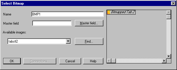
Figure 5-13: Select Bitmap Dialog Box
The Select Bitmap dialog box disappears and the outline shape of the bitmap appears in the window or dialog box.
The bitmap now appears.
You can use Controls on the Edit menu to put other controls after the bitmap in the list. Controls has no effect on the display until the window is hidden and reshown.
Dialog System provides default appearances for push buttons. You can use bitmapped push buttons to change the appearance of a push button.
For example, when you want a button to convey a graphic symbol, or you want to make the push button appearance vary depending on its state.
To associate bitmaps with a button:
The Push Button Properties dialog box, shown in Figure 5-14 is displayed.
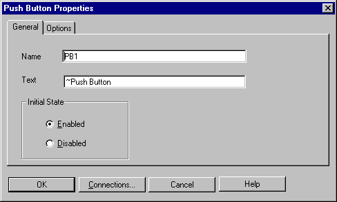
Figure 5-14: Push Button Properties Dialog Box
You see the options available, as in Figure 5-15.
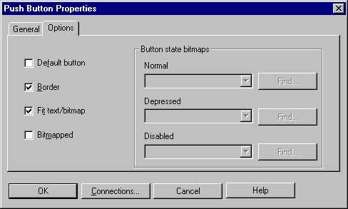
Figure 5-15: Push Button Properties Dialog Box - Options
This option becomes marked and the Button State Bitmaps options become available. There are three choices:
This bitmap file name is displayed as the selected bitmap file.
When creating a window toolbar, you may want to tailor your own version of the toolbar control program to implement a native Win32 toolbar.
Copyright © 2000 MERANT International Limited. All rights reserved.
This document and the proprietary marks and names
used herein are protected by international law.
| Window Objects | Using Dialog | |