UI Designer
How do I get to this dialog box?
-
Open a session document.
-
On the Appearance tab, in the Menus group, click UI Designer.
With the UI Designer, you can create new controls—including buttons, tabs, and menus—or modify existing controls on the Ribbon. Save your changes as a custom UI file (.xuml) that you can use with other session documents.
 Customizing the Ribbon
Design View
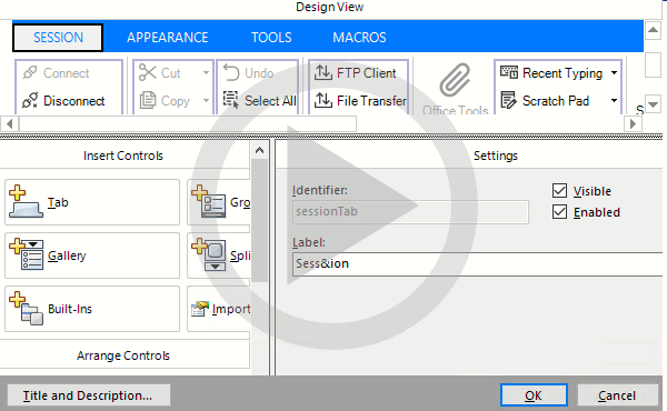
Displays a dynamic, graphical view of the ribbon and tabs. Navigate to and select the controls you want to modify.
Insert Controls
Click the items you want to add to the ribbon.
| Setting | Description |
|---|---|
| Tab | Adds a Ribbon tab on which you can place additional controls. |
| Group | Adds a container for controls. |
| Button | Adds a single button control. |
| Gallery | Adds a menu of buttons. |
| Split Button | Adds a button and a menu. |
| Button Group | Adds a button that contains three individual button controls, including split buttons and button menus (Galleries). |
| Built-ins | Adds a control for built-in features, such as Quick Keys and Office Tools. |
New items appear on the far right end of the ribbon. If a button or group is selected in the Design View, new buttons appear in the same group as the selection.
Arrange Controls
| Setting | Description |
|---|---|
| Move Up, Move Down, Move Left, Move Right | Moves the selected control in the direction specified. |
| Delete | Removes the selected control from the ribbon. |
| Select Parent | Selects the parent control, or container, for the selected child or group control. |
| Note: To select a button group, click the bottom edge of the group, or, select one of its buttons, and then, under Arrange Controls, click Select Parent. |
Review
| Setting | Description |
|---|---|
| Preview | Displays, in a separate window, the way the Ribbon will appear with the options you selected. |
Settings
This area of the UI Designer displays, for the selected control, the settings that allow or require additional input.
The specific items shown will vary, depending on the control that is selected.
| Setting | Description |
|---|---|
| Show dialog launcher button | Select to add a dialog launcher button next to the label on a Group. |
| Identifier | Use to identify the control when programming with the Reflection API. |
| Note: See "Dynamically Changing the User Interface" in the VBA Guide or the .NET API Guide. | |
| Visible | Select to display the control. You can use the Reflection API to show or hide the control. |
| Enabled | Select to enable the control. You can use the Reflection API to enable or disable the control. |
| Action | Shows the action assigned to the control. |
| Select Action | Click to specify an action for the selected control in the Select Action dialog box. |
| Modify Subitems | Click to add subitems to a control. For example, if you add a gallery to a button group in the Subitems Collection Editor dialog box, click Modify Subitems to add buttons to the menu for that gallery. |
| Change settings | Select to allow changes to the label, image, tooltip, and description of the control. |
| Note: Changes to these settings overwrite the default properties of the selected action. | |
| Label | Specifies the text that appears on the control. If you select an action that is set up to be controlled with a toggle switch (for example, the Connect/Disconnect action), another set of label boxes and images are displayed so you can set the default and selected labels along with their associated images. |
| Note: An ampersand (&) in front of a character in a label indicates that the character will function as a keyboard accelerator key. | |
| Image | Shows the image that appears on the control. Click Select to browse for a .PNG or .JPEG image to appear on the control. Click Remove to remove the image and display only the label for the control without an image. |
| Tooltip | Enter a heading that appears when the pointer is held over the control. |
| Description | Enter a description that appears (below the heading) when the pointer is held over the control. |
| Reset | Click to clear any of changes you've made and restore the default properties of the assigned action. |
More information