


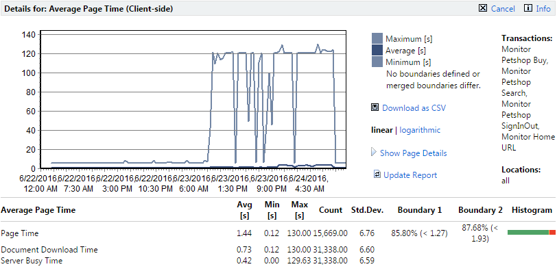
Page Time (dark blue), Document Download Time (light blue), and Server Busy Time (medium blue) are color-coded and graphed separately. Boundary 1 is color-coded yellow. Boundary 2 is color-coded red.
To view the response time of a specific transaction, you must de-select all other transactions in the Transactions section of the project overview report. The example performance detail charts in this section are specific to average page times only. Transaction Response Time, Custom Timer, and Custom Counter charts show average, ,maximum and minimum values, rather than page time, document download time and server busy time.
The above example shows a linear chart. Linear charts present data in a natural, intuitive manner. Logarithmic data presentation is also available (shown below).
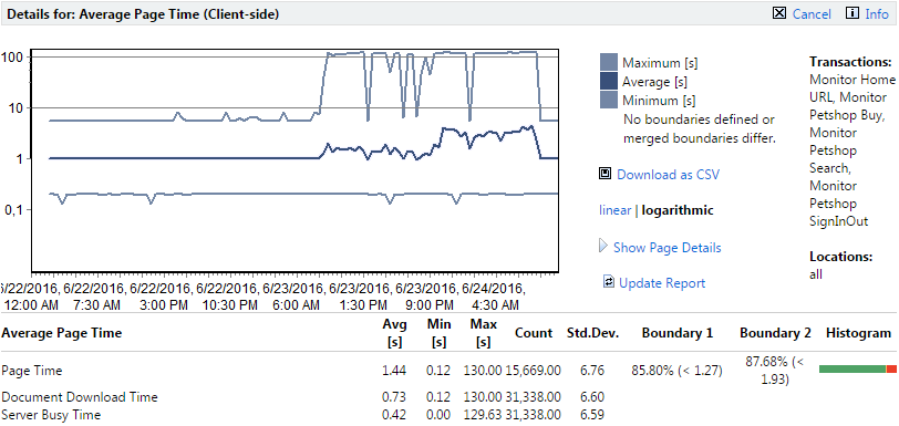
With logarithmic charts you see much more detail in small values. Logarithmic data presentation is well suited to charts with measurements that do not vary much, but have abrupt spikes (large maximum measurements, small standard deviation). An example of ideal logarithmic chart use involves a value in a range that generally remains between "0.1" and "1," but has an abrupt spike to "100." On a linear scale, most of the values would be squashed in a small range along the bottom of the chart, one or two pixels in height. On a logarithmic chart, the values would receive 1/3 of the chart's space-"0.1 - 1" taking up the same space as "1 - 10" or "10 - 100"
To toggle between logarithmic and linear data presentation, click Linear and Logarithmic.
To view a tool tip that has details about a specific time interval, hold your cursor over a time interval of interest.
To progressively zoom into chart details (and thereby limit the amount of time covered by a chart), click a time interval of interest. To zoom out of a chart, use the Less ("-") magnifying glass link.
The calendar and Select range features can be used to refine the time period covered by transaction Details pages.
Transaction performance data can also be downloaded in CSV (Comma Separated Values) format for use in spreadsheets and other charting engines.
Click Download as CSV to download performance data to your hard drive in CSV format.