Performance Manager organizes health monitor results into a collapsible, tree-like structure that keeps detail at the top level to a minimum. Expanding and collapsing levels in the tree structure makes it easy for you to drill down through long lists of monitor results. Each custom/page timer in the report has a dedicated row. Current health ratings are shown for all results that have boundaries defined for them.
Isolating problematic components with the Performance Manager project overview report involves a drilling down process in which good performance data (time intervals, locations or browser types that do not report errors) is stripped away so that more detail regarding problematic elements can be revealed-and ultimately information that facilitates issue resolution is identified.
You can use the project overview report's Select All, Deselect All, and Update Report links to filter information and focus on areas of concern. Likewise the calendar and Select Range functions allow you to focus on periods of concern while disregarding periods of good performance.
To illustrate, consider that you have discovered a poor high-level health rating. On its own, this rating is not all that informative-it simply tells you that a problem exists somewhere in the system. By looking further down the report (i.e., by drilling down), you might discover that the cause of the poor Health rating is a poor Availability rating. Although that information offers some insight, it is still not all that helpful. You need to drill down further through the result data to get to the information that will help you resolve this issue.
Further down the report you might see that one of the transactions has been experiencing a problem while the other transactions have not been experiencing problems. Now you have some helpful information: one of the transactions is experiencing an availability problem. Still, the cause of the problem is not apparent. At this point you might deselect the properly functioning transactions to narrow the results down to the information that is related to the transaction that is experiencing an availability problem, and filter out all error-free performance data.
Finally, toward the bottom of the report, in the Location section, you might see that one of the locations-the location that is serving the transaction in question-has been having problems. Now you've got information you can act on; the cause of the overall poor health rating is not related to the application; it is related to a network problem at a specific monitoring location.
While the discovery of correlations between results is the first step in root-cause analysis, detailed analysis of results is the second step. In addition to generating TrueLog files for front-end diagnostics, Performance Manager provides detailed page break-downs for page timers.
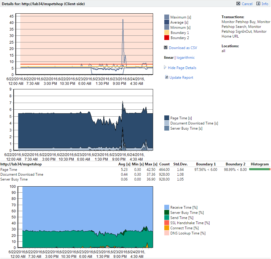
When you click a monitor you are taken to a detail page for that monitor. #1 boundaries (below which performance is good) are color-coded yellow. #2 boundaries (above which performance has failed) are color-coded red. Good, warning, and failure ranges are also color-coded in the charts.
Hold your cursor over a chart to display percentage break-downs of each measurement in a tool tip.
When you click the Show Page Details link you are presented with two more diagrams that offer a simple break-down of page timings, document downloads, etc. The third diagram offers more detailed analysis (connection handshake, SLL/TLS Overhead, HTML code, embedded objects, network details, etc).
The third (bottom) chart shows how time was spent during each time interval. It indicates what percentage of download time was spent sending requests, receiving information, etc. Hold your cursor over this chart to display a tooltip that tabulates the totals.
The results are displayed as a percentage, and not an actual value, because the overall value may be greater than the actual page download time. For example a browser will download a page from the server using several connections. If you added the sum for all of the measures displayed, the connect time, SSL handshake time, send time, receive time, server busy time, and DNS lookup time, the overall time can be larger than the actual download time (Page Time) by up to four times if four connections are used in parallel.
Dividing the total time by the number of connections will also not offer an accurate value as not all of the connections will be used throughout the entire download time and therefore the sum divided by the number of connections would be too small.
This means that it is only possible to display the times relative to the others, for example the receive time took 64.89% of the overall time when compared to the send time, which took 30.30% of the overall time.