Performance Manager heat fields offer a quick shorthand for conveying health rates.
Each field represents a time interval and each field's color indicates the health during that time interval:
- Heat fields are used for each of the three health dimensions (performance, accuracy, and availability) in addition to overall health.
- Health dimensions use a range of 0 to 100.
- Green (66 - 100)
- Yellow (33 - < 66)
- Red ( 0 - < 33)
- Performance is less than 100, but greater than 80 when performance values for the monitor are less than bound1 (the bound that indicates "good" performance).
- Performance equals 0 when performance values for the monitor are greater than bound2 (the bound that indicates "bad" performance).
- Performance is greater than 50 when performance values for the monitor are less than bound2.
- All performance values between bound1 and bound2 are between 100 and 50 and are interpolated using a logarithmic function.
See
Interpreting Measured Data for more information regarding boundaries.
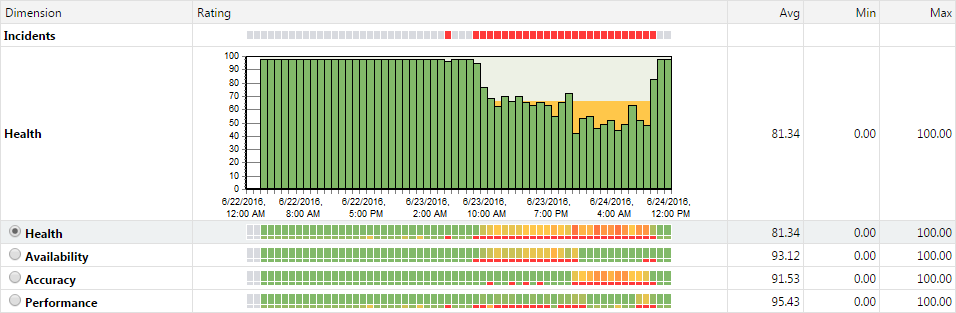
Each time interval, or column, is broken into six rows-each row represents a different dimension of system health:
-
Incidents - Red fields indicate errors or service target violations. Blue fields are informational. Yellow fields indicate warnings. No differentiation is made between custom incidents and system incidents.
-
Health (detailed) - Fields in this row are not heat fields. This row is a histogram that displays overall health as a value between 0 and 100. Health values between 33 - 66 are indicated by yellow. Health values of 0 to 32 are indicated by red.
-
Health (summary) - These heat fields signify aggregate health, factoring in system availability, accuracy, and performance.
-
Availability - These health fields signify system availability.
-
Accuracy - These health fields signify system accuracy.
-
Performance - These health fields signify system performance.
Each heat field is comprised of two elements: (1) a larger box that signifies the average health value recorded during the interval, and (2) beneath that, a smaller box, which signifies the minimum health value recorded during the interval.
To view a small "roll over" dialog that details a specific time interval, hold your cursor over a time interval of interest.
To progressively zoom into chart details (and thereby limit the amount of time covered by a chart), click a time interval of interest. To zoom out of a chart, use the Less ("-") magnifying glass link of the calendar tool at the top.