Charts
When the Group By option is in effect, three graphical chart options, bar, pie, and line, become available on the toolbar and the context menu, allowing you to display query results in a graphical format.
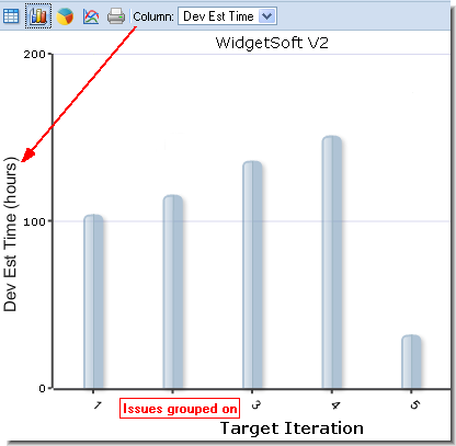
Bar Chart
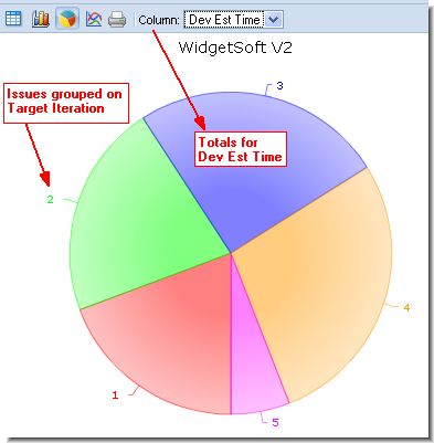
Pie Chart
Line Chart
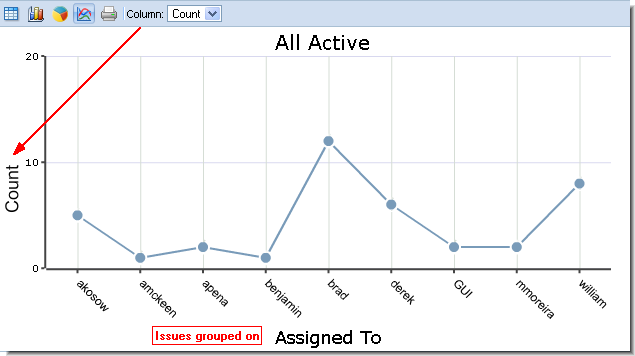
The field that the issues are grouped by creates the horizontal axis of the bar chart or the labeled sections of the pie chart. The left-most column with summed data creates the vertical axis of the bar and line charts or the sizing for the wedges of the pie chart. This value can be changed using the Column list on the chart's toolbar.
To return to the list of grouped issues, click the
Show Issue Table button
 on the issue list toolbar.
Printing charts
- Click the Print button. The chart appears in a separate browser window or tab with its own Print button.
- Click the Print button. The standard Print dialog box appears.
- Specify settings as required and click OK.
Linking to Charts and Grouped Issues
You can distribute URLs for groups and charts created for public query results. For example, you can run a query, group results by a specific field, and then render those results as a pie chart. If you want to share that chart, you can create a URL to provide other users with access.
To create the URL, right-click the query and choose Properties. This allows you to save or email the link for the query result. See Using URLs to Access AccuRev Data for more information.