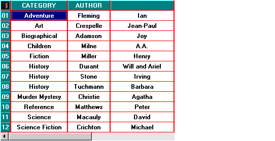
Grid

The GRID control is a two-dimensional table of data fields. Each element of this table, called a cell, can hold either text or a bitmap, or both. Grids are relatively complex controls with many properties that you can use to customize their appearance and behavior.
Currently the grid control is supported only in Windows environments. Attempting to create a grid control on other systems will fail, causing the handle to be returned with the NULL value.
Grids are organized into rows, columns, and records. In a grid, a row is a grouping of cells that appear on one line in the control. A record is one or more rows that are treated as a logical unit. A column identifies a particular cell in a record.
By default, a record occupies one row in a grid, but you can arrange for a record to wrap around to the next row when it passes the right edge of the grid. When this occurs, a record will occupy more than one row in the grid. You might want to construct a grid like this when you want to see many fields in a data record at once. Alternatively, you can have the grid use scroll bars or wheelmouse events to access cells past the right edge of the control. Column, row, and record numbers all start at 1.
Grids come in two formats: with horizontal scrolling and without. When you opt for horizontal scrolling, each record may occupy only one row in the grid. Grids with horizontal scrolling appear much like a spreadsheet. Without horizontal scrolling, a record may occupy more than one row. In either case, vertical scroll bars appear automatically when needed (providing you allow them with the VSCROLL style).
A grid's capacity is limited by available memory. The grid uses a sparse storage technique in which records with no data have no memory allocated for them. A grid may not have more than 99 columns. There are no other practical limits [2 giga records (2,147,483,647 records) and 2 GB text per record]. A single cell may contain no more than 32,766 bytes of text.
The grid operates in two modes: navigate mode and entry mode. While it is in navigate mode, the arrow keys move the cursor around the grid. This is the default mode. The grid shifts to entry mode when the user starts to modify data. In this mode, the arrow keys are used to edit the current cell's data. When the user finishes a cell, the grid returns to navigate mode.
The exact set of keys understood by the grid depends on the host system. Under Windows, the following keys are used in navigate mode:
| Up/Down Arrow | Moves cursor to the same column in the previous/next record |
| Left/Right Arrow | Moves cursor to the previous/next column in the record |
| Tab (with USE-TAB) | Moves cursor right, wrapping to next record when at last cell in record |
| Backtab (with USE-TAB) | Moves cursor left, wrapping to the previous record when at the first cell in record |
| Home | Moves to first column in record |
| Ctl-Home | Moves to first column of first record |
| End | Moves to last column in record |
| Ctl-End | Moves to first column in last record |
| Page Up/Down | Moves cursor up/down one page |
| Enter | Shifts to entry mode for the current cell; highlights contents for editing |
| Shift-Enter | Moves cursor to the first column of the next record |
| Any printable character | Shifts to entry mode for the current cell; overwrites contents with character |
When in entry mode, the user types into an entry field control. All of the editing keys usable by an entry field are usable here. The user leaves entry mode by using Enter or Tab/Backtab, or by clicking on another cell with the mouse. The special property FINISH-REASON can be used to ascertain why the user left entry mode.
Clicking a mouse on a cell moves the cursor to that cell. Double-clicking a cell shifts to entry mode.
Grids can have row and column headers. Use the ROW-HEADINGS style to establish row headers and the COLUMN-HEADINGS style to make column headers. Headers are normal cells with certain special traits:
- Headers are always visible, regardless of how the user scrolls the grid
- The cursor does not move into a header cell
- The special properties HEADING-COLOR, HEADING-FONT and HEADING-DIVIDER-COLOR apply only to header cells. The style TILED-HEADINGS applies only to header cells
- The events MSG-HEADING-CLICKED, MSG-HEADING-DBLCLICK, and MSG-HEADING-DRAGGED apply only to header cells
Otherwise, headers are normal cells. When you use column headers, record 1 becomes the column headers. When you use row headers, column 1 of each record supplies the row headers.
The grid control can have different colors and fonts assigned to each cell. For convenience, there are several ways this can be done. For example, you can set the color for the grid as a whole, for a particular row or column, or for a particular cell (in addition to other techniques). For a particular cell, there could be several colors or fonts specified for it. The grid picks the color or font to use by applying a priority list. The first item in the list that provides the color or font is the one that is used. For colors, this is determined independently for foreground and background colors.
For colors, the list of priorities is as follows (highest applying first):
- CURSOR-COLOR
- DRAG-COLOR
- REGION-COLOR
- CELL-COLOR
- HEADING-COLOR
- ROW-COLOR
- COLUMN-COLOR
- ROW-COLOR-PATTERN
- Grid's overall color
For fonts, the following priority list is used:
- CELL-FONT
- HEADING-FONT
- ROW-FONT
- COLUMN-FONT
- Grid's overall font
Currently, the grid control is available only under Windows.