Drawing Controls with Drag-and-Drop
If you have defined one or more data sets within your program, as discussed in Working with Data at the Program Level, the data items from the corresponding FD are listed in the Screen Designer Drag and Drop pop-up window. This window also lists Working-Storage, Linkage, and other data items defined in your program.
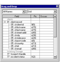
By default, this interface lists the field names as they are declared in the program. If, however, you have used the XFD tab of the File Designer to assign a Name directive to a field, you can elect to have that name appear in the Drag and Drop interface instead of the field name. When you choose this option, the Title property for any control that has a Name directive will show that name, rather than the actual field name. For information about enabling this option, see Designing a Custom XFD.
The Drag and Drop interface allows you to select a control type and one or more data items, then draw the control on the screen. AcuBench automatically adds the data item to the control's Property sheet as a Value Variable, generated Screen Section code to assign the item as the control's VALUE property. In addition, if you select a combo box, grid, list box, paged grid, or paged list box control type, additional code is generated to populate the control with data when the screen is loaded. These controls, referred to as autoload controls, are discussed in Creating Autoload Controls.
To use the Drag and Drop window to add controls to your screen:
- Right-click the screen form and select Drag-and-Drop from the pop-up window. You can also select the Drag-and-Drop command from the View menu.
- From the drop-down list in the top, left portion of the interface, select a data source category. By default, All Names is selected, indicating that all Working-Storage, Linkage, and FD items defined in the Structure view appear in the list.
- From the drop-down list in the top, right portion of the screen, select a control type.
- Select one or more fields from the list of data items. To select non-contiguous items, hold down the Ctrl key as you click.
- When you have selected all of the items that you want to draw on the screen, lift up the mouse button, position the pointer
over any of the highlighted fields, then hold down the mouse button while dragging the pointer to the screen form.
In most cases, when you release the mouse button, the control(s) is/are drawn on the screen. If you have chosen either a radio button control or one of the autoload control types, a second interface appears, allowing you to configure the behavior of the selected control. In these circumstances, when you click OK in the secondary interface, the control is drawn on the screen.
Using Drag-and-Drop to Create Radio Buttons
Radio button controls are used when the user must select one and only one of a series of options. As a result, each individual radio button control is placed within a group, and the run-time ensures that only one member of the group at a time can be selected.
When you use Drag-and-Drop to create a radio button, the initial steps are the same as any other control. You select a control type and a data item, then drag the data item to the screen. When you do this, the Make Radio Button dialog box appears.
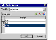
This interface represents a group of radio buttons. You add individual radio button controls to the group corresponding to each of the available options.
To add items to the group of radio buttons:
- By default, the name of the selected data item appears as the first and only radio button in the group. To change the name
of the first radio button to something more descriptive, double-click the field name in the Prompt list and add a more descriptive name.
The name listed here is assigned as the control’s title, which appears next to the radio button on the screen.
- Click the Add button. The Add button is the first of the three buttons just above the Prompt list, on the right side of the interface.
- The new radio button is assigned the default name Radio1. As with the first radio button, double-click in the Prompt field to enter a more descriptive name for the button.
- Repeat this process until you have added all necessary group items.
- When you are finished, click OK. The group of radio buttons that you have described is drawn on the screen. You can now size and position the controls on the screen.